How do we turn more visitors into users?
Company
Atom Learning
Role
Lead Designer
Areas
Website, Sign-up CRO
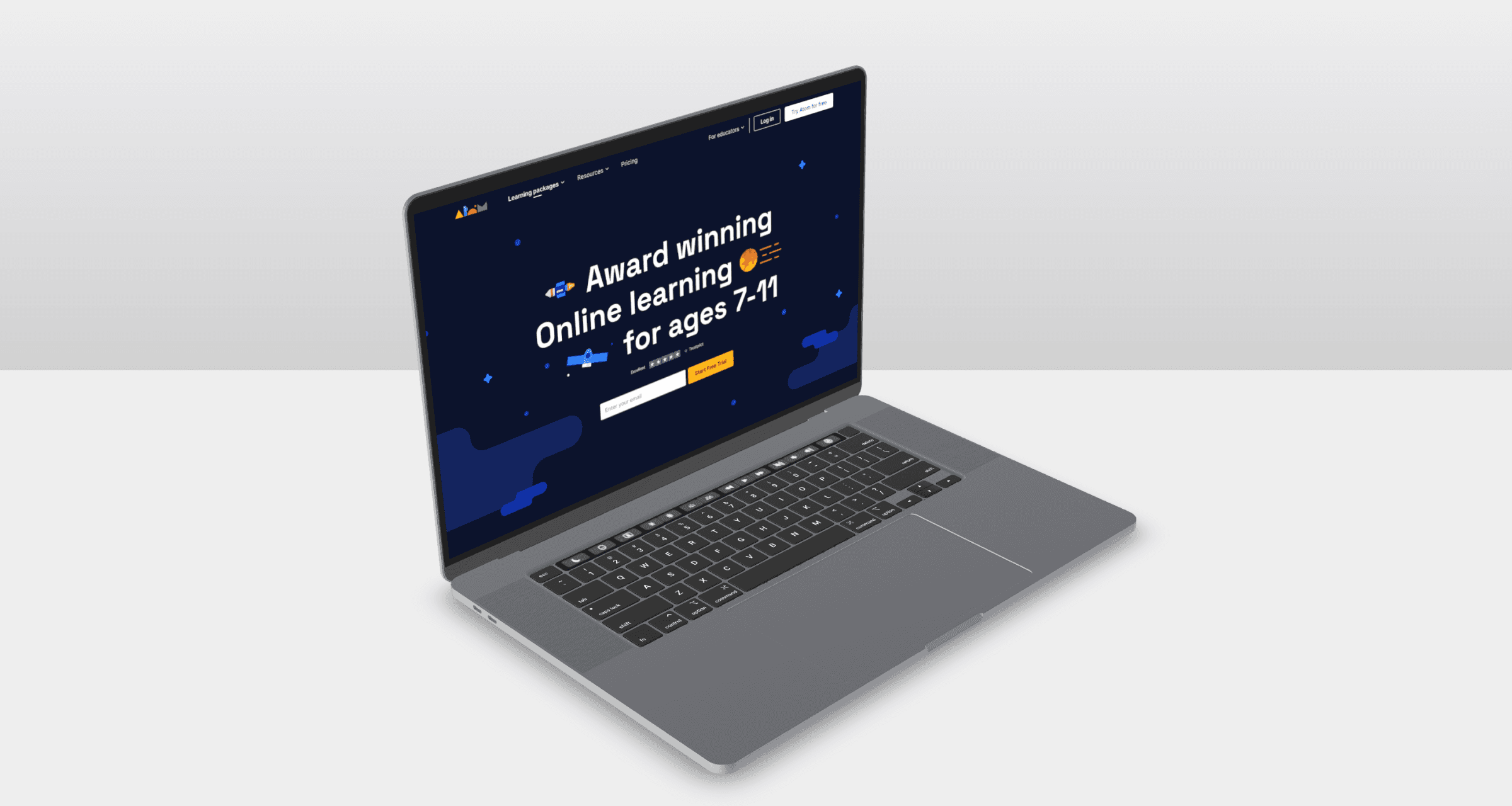
Atom Learning, a UK-based e-learning platform, was facing a significant seasonal surge in website traffic. However, their conversion rate to free trial users was really low.
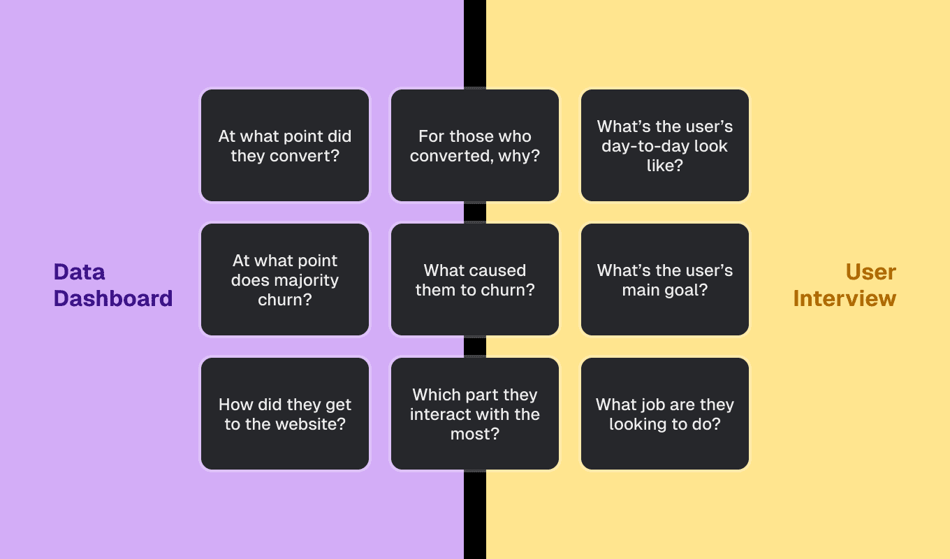
To consolidate and define the problem, I came up with initial questions and a plan to solve them using Quantitative and Qualitative Analysis.
Qualitative and quantitative approach to research.
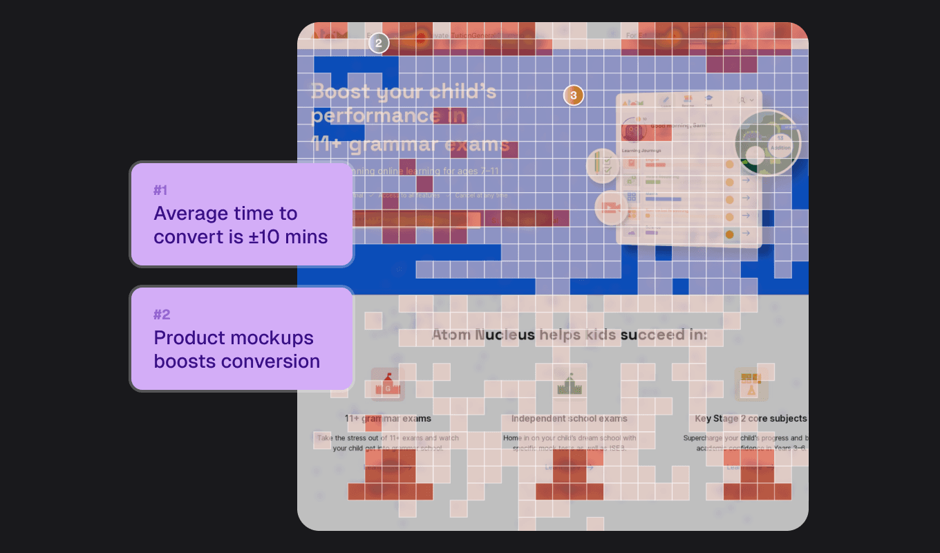
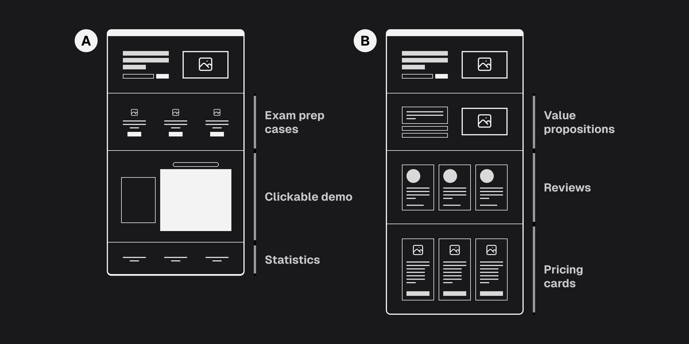
Hotjar recordings indicated that even visitors who converted had to spent considerable time browsing the website, a behaviour encouraged by the many links to other pages in the website. Conversion also tends to happen after visual demonstrations of the product.
Hotjar analysis on the home page.
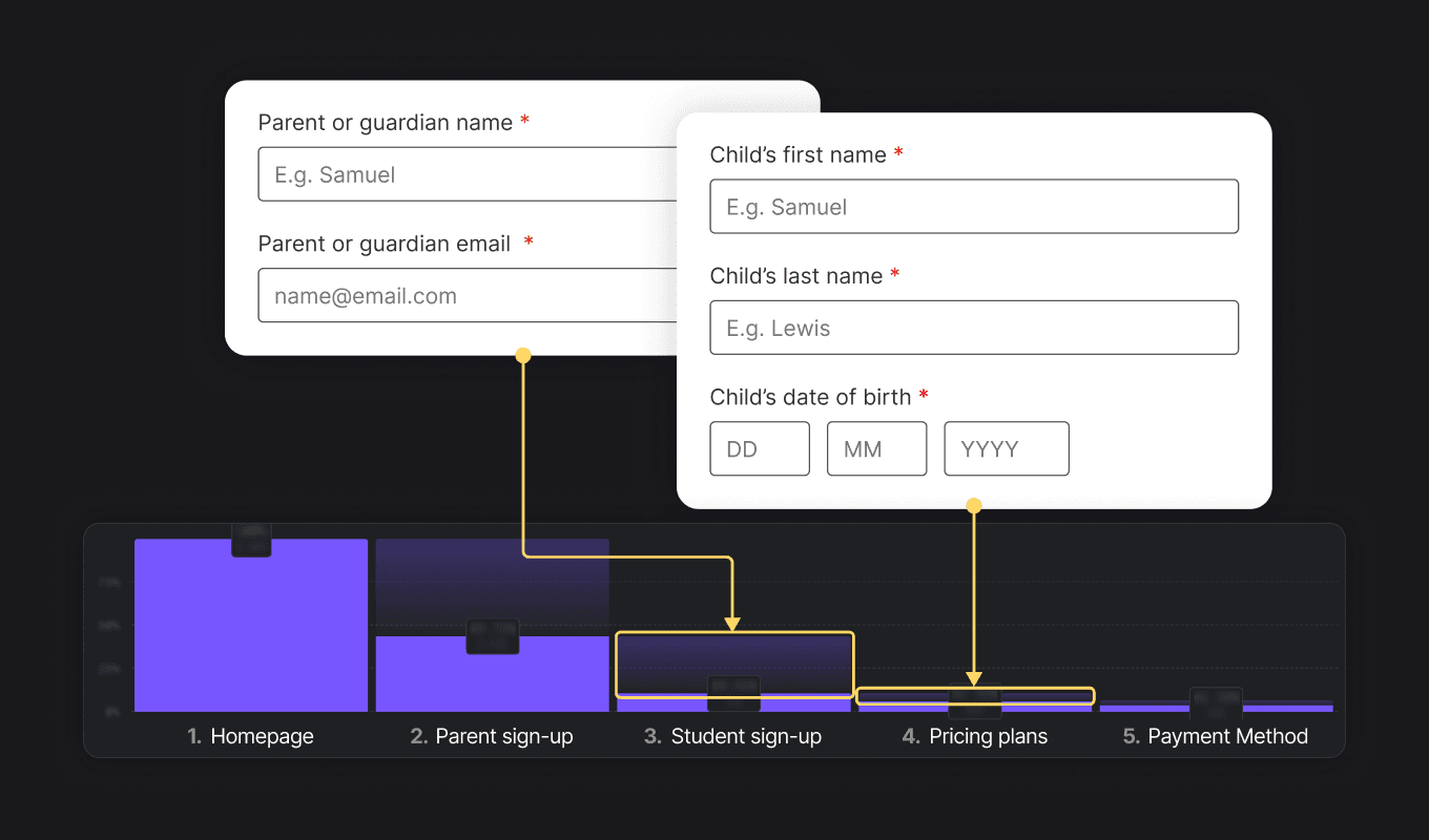
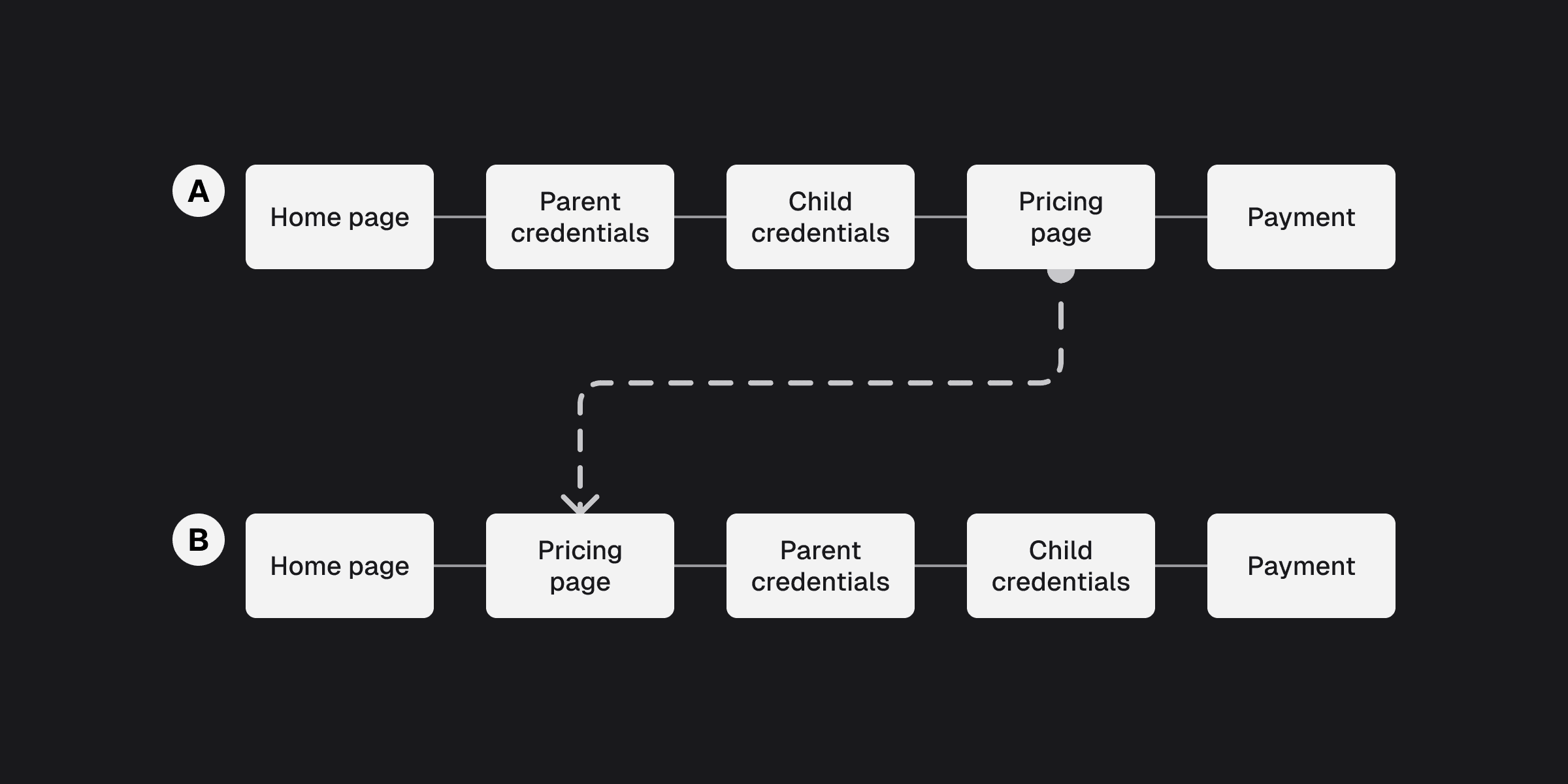
Mixpanel analysis shows two unusually high churning points in two steps of the sign up process where we ask for credentials. I found out that users were hesitant due to lack of context of why they need to provide it.
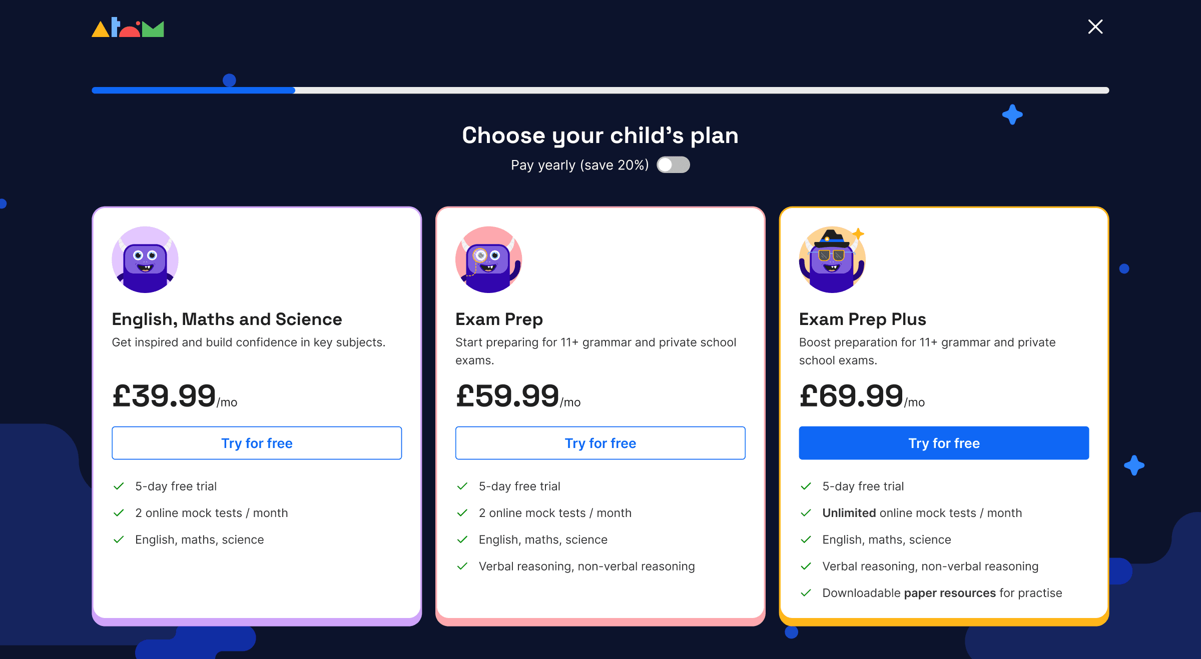
On the other hand, the pricing page was actually where users had their a-ha moment about the product.
Mixpanel analysis on the home whole sign-up flow.
A (control) / B (treatment) test plan
A/B test plan on the sign-up flow.
—https://lawsofux.com/hicks-law/
After visual refinements, the overall project resulted in an approximate 38% growth in the sign-up rate compared to where we started. Following this success, we extended the redesign effort to the rest of the website.
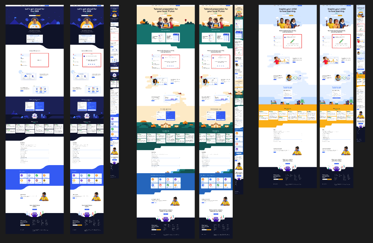
The website after the visual design update.
The pricing plans.
Mini explorations that didn't make it.
Responsive design on all landing pages.
